February 14, 2006
On websites and usability
Like so many other colleges, Knox suffers from that common disease, crappywebsitis. While the front pages look very pretty, it's always hard to find what you're actually looking for, even if you're part of the "target audience", which is prospective students. Good luck finding a campus map, for instance. It's even worse if you're not in that group. We're in pre-registration season right now, so let's look at the spring course schedules... a minimum of four clicks away from the homepage, and that's if you know where to look.
Map the website over time and the situation gets even worse. The software they use assigns each page a helpful identifier like "x770" (that's for the Knox FAQ, obviously). Make a new page, and it'll get a new identifier. That makes it difficult to bookmark things like "current term course schedule", but it's even worse than that. You can bookmark something like this faculty page (at x2849), and march along happily until someone tells you to look for a link on "the faculty/staff page" that just isn't there. It turns out that it's on this other faculty page (x5875), which is what you get to now if you click "Faculty & Staff" on the main site.
Now here's the kicker: page 5875 has been the "current" faculty and staff page for more than two years now. There is no way to get to 2849 from the main page, as far as I know. But there is no indication on 2849 that it has been superseded by another page, or that page 5875 even exists. And there are things on 2849 that aren't on 5875, and it's easier to use. AND IT'S STILL BEING UPDATED! Look at the right-hand column: those are current events! It's actually a much better page. So I have them both bookmarked.
A big reason the new one is a much worse page is that it violates expectations about how webpages work. Consider this screenshot:
Say you wanted to go to the Registrar. You'd click on the word "Registrar", right? But no, that's just text. You need to click on the header ("ACADEMIC RESOURCES"). That pops up a separate window with a list of a dozen or so links in it, and when you click those links, they close that popup and follow the link in the original window. Broken, broken, broken.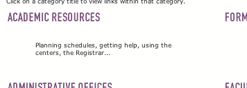
The course schedules are a comparatively un-broken part of the website, once you've found them, and ignoring for a moment the fact that there is a little "TOP" graphic (what, I couldn't find the "home" button?) that manoeuvres itself into the left of the window as you scroll, carefully covering up the titles of the bottom several courses currently visible. The big problem here, though, is that it's just a flat list, and only marginally better than a printed-out copy. There's no easy way to search for "courses offered 6th hour", or "courses that meet the diversity requirement". And there's really no way to search for "courses that don't have any prerequisites", which is important when you're a freshman and have a somewhat limited set of courses available to you. (A lot of courses require "sophomore standing".)
So last year I asked the registrar if I could hook into the database and write my own front end. For security reasons I don't hook in directly, but I get a dump of the course database and process that into a variety of flat viewsstill not searchable (maybe this is a future project!), but at least you can scan through a list that's sorted in various ways. The resulting course schedules have proven very popular both with students and with faculty, and I've kept it up each term. Why are they so popular? Because they don't surprise you with weird interfaces, they don't do anything super-flashy and therefore work just fine even on the ancient machines some people still have running System 8 and Netscape -2 or whatever. And because they actually present information, which is what people are really seeking when they go onto the web, in a way that people can actually use it.
Graphic designers take note: if you're ever called upon to design a website, make sure to take into account a lot more than just the look of the thing.
"Some luck lies in not getting what you thought you wanted, but getting what you have, which, once you have got it, you may be smart enough to see is what you would have wanted had you known." --Garrison Keillor
Posted by blahedo at 2:50pm on 14 Feb 2006The site wasn't always that bad. Back in '99-00, it was a ton more useable than it is now, if not quite as "visually appealing." For example. (You can also check out the rest of the archived pages.) I'm just glad I don't have to deal with that site on a regular basis anymore.
I wish you had been around back then Don-- not only because you're an outstanding teacher but because those schedules of yours would have been as helpful then as they are now!
Posted by Brian at 2:24pm on 17 Feb 2006