10 Sep 2018
Another misleading infographic
Today we have another installment in our occasional series, "infographics that are not really telling the truth". This one is not actually quite as bad as I thought it was at first, but it does still tell a story that is wrong in a fairly important way.
The image, reproduced below, is from the Guardian's article "Sweden faces political impasse after inconclusive election".
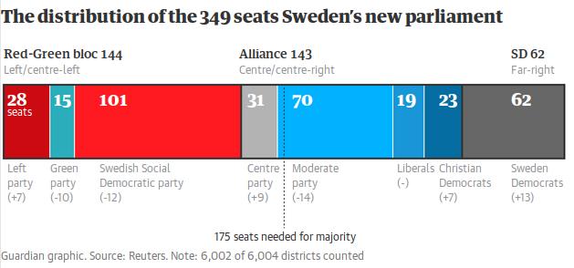
My first signal that something was weird was the dotted line down the middle. If that's representing 175 seats, why is it so far to the right? The red-green block plus the Centre Party make 175 exactly. And the bar that's ostensibly 31 seats is waaay less than half the one that is 70, and looks comparable to the one that's 19.
So I replotted it. The dashed line actually was in the right spot; I haven't moved it or any of the labels, nor have I changed any numbers---just the coloured bars, to reflect the actual proportions.
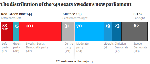
And indeed, it's not as bad as I thought; the problem I first identified really was the biggest error. But the important story of this infographic is: if the red-green bloc wants to form a government, who do they need to bring into their coalition (or at least acquire parliamentary support)? In the Guardian's graphic, the Centre Party clearly wouldn't be enough. But in fact, if they can be peeled off, that would be enough to form a (razor thin) government. Which is important.
"With absolutely no understanding of how narrative, plot, character development, or exposition work, Rand produces fiction that sounds like it was written in Urdu and translated into English with the least reliable free online translator available." --Ed Burmila