June 29, 2020
Straight lines, exponential curves, and Covid-19
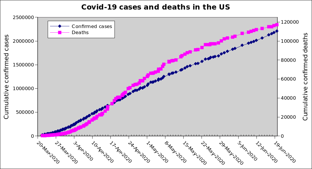
Well, we just passed a half-million deaths globally and 10 million confirmed cases; and in the USA 2.5 million (that's a quarter of all global cases) and are about to hit 125,000 deaths (about a quarter of global deaths). And we just got ourselves banned from travel to the EU because we can't get our shit together on thiswatch for much of the rest of the world to follow suit. I've been tracking in a spreadsheet a variety of posted numbers[0] for the Covid-19 pandemic (because of course I have). For quite a long time now, the graph of the nationwide numbers has looked basically like this:
The Covid-related death rate (magenta dots, scale on right) started out as a clear exponential growth curve, then started to level off but never really got completely under control. The case rate (blue dots, scale on left, 20x the scale of the other one) started out with a slight exponential growth and then proceeded into the most linear line I've ever seen for a natural process. Seriously, I can hold an index card to the screen and touch every dot from 1 May through 20 June (which is the end date of the above graph). I could do the same trick from about 10 April through 1 May on a slightly steeper line.
Of course that line was not entirely natural. The shape of the death curve gives us some indication that the line of the actual case count must have been steeper at various points along the waybut many cases were kept from the confirmed count due to testing availability, false negatives, mild symptoms, and so on. Still, it was impressive how straight that line was over such a sustained period.
Then states started opening up. I mean, a lot of them never really closed properly in the first place, which is why we couldn't get this under control like so many other countries have. Some states (like Virginia) put the right kind of regulations in place but then explicitly refused to enforce them in any way, shape, or form, resulting in a big chunk of the population just ignoring them; others issued a "stay at home" order but didn't even bother to encourage masks or close public businesses. Nevertheless, a lot of Americans took the cue from "the state is open again" to go out as if nothing had changed. That really got going about three-ish weeks ago.
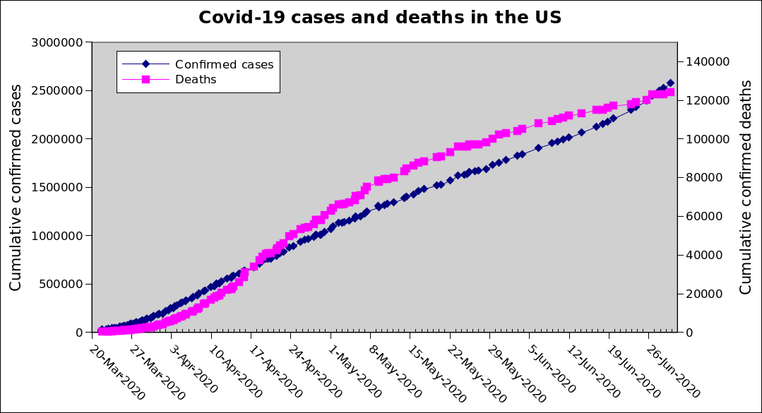
Which brings us to this. Same graph as before, updated through the 29th instead of the 20th:
The scales go a little higher, though they're still in a 20:1 relationship. The deaths have, for the moment, continued to level off. The cases, though; that surprising straight line that continued for more than a month and a half is definitely not in force anymore. If we're back to an exponential increase curve on this (Narrator voice: We are.), this is going to get Real Bad, Real Soon. And as before, the next 5-14 days' worth of confirmed cases have already been infected, so even if nationwide we somehow implemented perfect containment procedures instantly, the case count would still get visibly worse for at least another ten days, and the death count will start to ramp up a bit after that.
And this is still the First Wave. Buckle up, folks.
[0] From the Washington Post, which is in turn sourced largely from the JHU numbers.
"Within the Democratic Party... progressives share a political party with another group of people---the corporate neoliberals---who we disagree with on almost every single issue of substance." --Robert Cruickshank
Comments on Facebook
Posted by blahedo at 9:20pm on 29 Jun 2020
