June 21, 2018
Telling a better story with a US map
The other day I was reading an article about
the (un)affordability of housing in the US. It contained the following image illustrating the hourly wages required to afford a 2-br rental in each state: ![]()
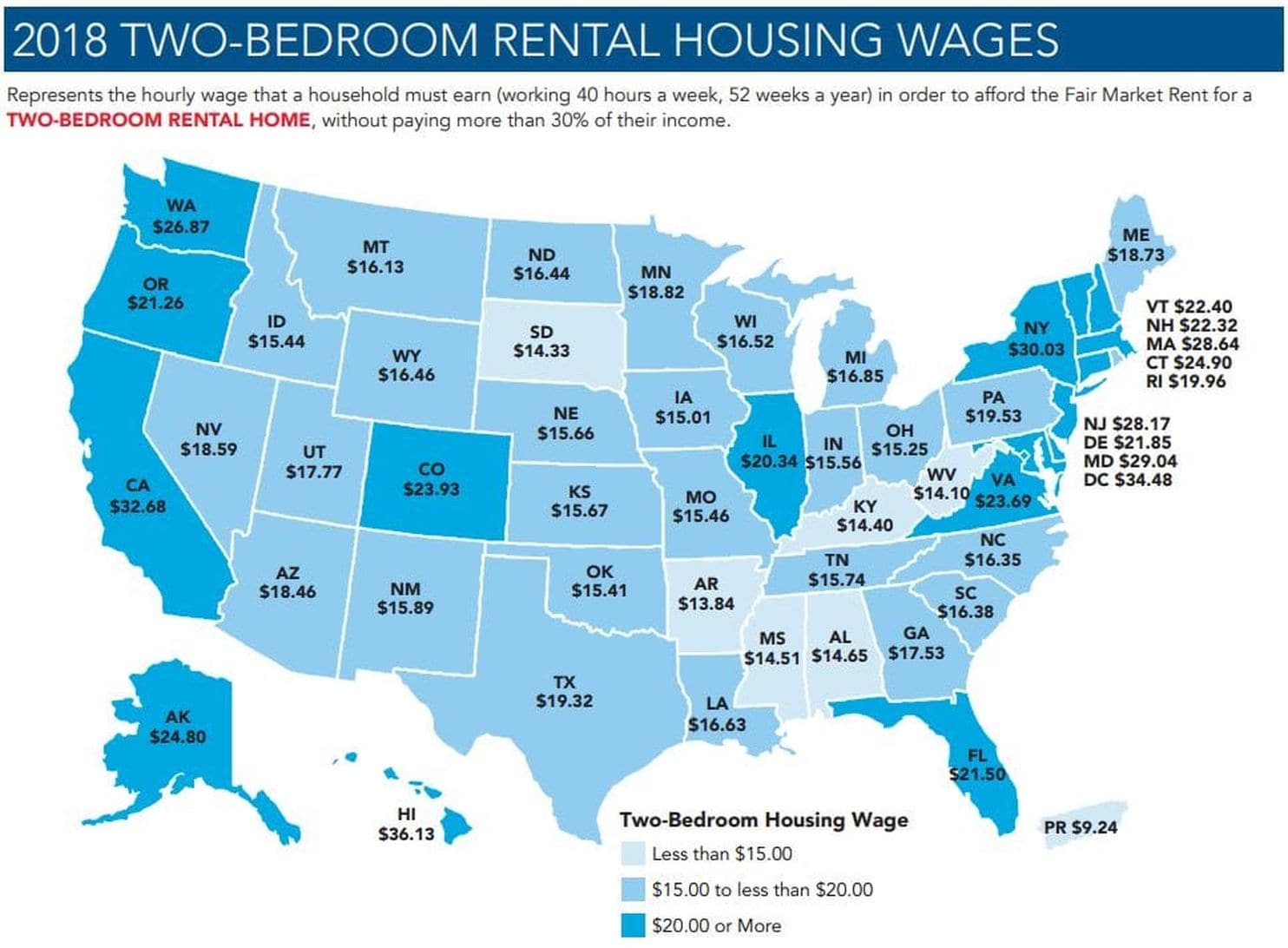
The NLIHC has putting these out for a while, so you might have seen it before even if you missed this year. The article in the Post was focused on DC specifically, of course, but the map was not really telling a very coherent story. The granularity of a state-by-state map for that is all wrong---the dark-blue (high cost) states were just the ones with bigger cities, mostly... though with some interesting exceptions that the map format completely hid from view. But there's Illinois at $20.34, about $5 more than the adjacent states. Isn't that really just Chicago, though? Cairo's not going to be too different from Paducah or Cape Girardeau, and Rockford's probably comparable to Janesville, and Freeport to Dubuque. Similarly for e.g. CO, maybe VA and the west coast states, and who can tell on the mid-Atlantic states? So: what if...
What if the map treated Chicago(-land) as a separate state from the rest of Illinois? And likewise for the other bigger cities? I knew that the US Census had made up clearly defined Metropolitan Statistical Areas (MSAs) for every city of any substantial size. So it actually seemed entirely plausible that you could take the top 40 or so MSAs and treat them as states, and then treat the "rest of the state" as a separate area to take an average of. I was quickly able to track down a listing of MSAs by population (thanks Wikipedia), but with only a bit more work I was able to track down the following, each in either .cvs or .xls (i.e.: easily computer processable) format:
- A list of each county or equivalent in the US, by name and with associated unique identifier called a FIPS code [0]
- A list of each MSA and µSA ("Micropolitan Statistical Area") in the US, with associated MSA code, and the FIPS code of every county in that MSA/µSA [1]
- A list of the population of every MSA in the US [2]
Perhaps even more importantly, I found an amazingly helpful post that pointed out that there was an .svg (i.e. not pixellated) map of the US, with county lines, on Wikimedia Commons, and that .svg file is fundamentally an editable text/xml format, and each county was helpfully marked with its FIPS code. Meaning it is super duper easy to make maps with counties colour-coded however you might want. Proof of concept: randomly colour each state, and the top-40 MSAs.

Yesss! This is perfect! You can see the multi-state-spanning populous MSAs pulled out separately from the constituent states. Now to pull in the data to actually visualise. Conveniently, the NLIHC show their work (mostly) and pointed me directly to
- A list of every county* in the US along with the "fair market rent" (FMR) in that area for 0-4 bedroom rental units, as well as the population of that area [3]
(* Ok, it turns out that the six New England states do have counties but mostly report their info by town instead, which are more like what we'd call townships elsewhere and they function as mini-counties. This particular list had them broken down to that level, which my map didn't, so I had to aggregate those first.)
So now I have per-county numbers, and a map-colouring system I'm itching to try. What would it look like if I assign colours to each county based on only that county's FMR? I adopted the same colouring scheme as the NLIHC map that inspired this project, with a slight extension: the "over $20" category I broke up into "under $30", "under $40", and "over $40", because at the county level some of the FMRs were over $60 (looking at you, Bay Area).*** The higher categories just used ever-darker shades of the same blue-green palette as the original map.
(*** The actual FMR numbers in the report are monthly rents, with ranges like "$850" or "$1100". To match the NLIHC maps, I multiply FMR by 12 and divide by 0.3 (to get "affordable" yearly rent), then divide by 52 (weeks in a year) and divide that by 40 (hours in a workweek) to get the required wage.)
All this yielded the following map:

Some spot-checking verifies that the underlying numbers are correct, and the more urban areas reflect a higher cost of living, withas expecteda much more uniformly cheap band across the Midwest and South. This sort of map is actually pretty common (and is, as I mentioned, surprisingly easy to make) to display county-by-county data. But in a lot of ways, it's now too noisy in the other direction to tell a coherent story. So I'll keep following through to produce the states-and-top-MSAs map that I thought would be interesting originally.
So here's the methodology: from that FMR data, which is per-county, I aggregate into 89** multi-county groups. Within that group, I do a weighted average: the 2BR FMR for a county, times the population of that county, added up for all the counties in the group and divided by the population of the MSA or rest-of-state region. Another way to think about this is, if you assign "this is my FMR for a 2BR rental" to every person in a region according to which county they're in, then take a regular average over the whole region. This gives each of the 89 regions an average FMR. Then, assign that average FMR back to every county in that region, and colour the map accordingly.
(** Every state except RI, plus the 40 top MSAs. Why not Rhode Island? Because the Providence MSA completely encompasses it! Interestingly, no other state was completely encompassed by top-40 MSAs, although New Jersey was close.)
By way of checking my work and my aggregations, I did want to run my code without the MSA stuff, just the states, to see if my numbers matched the NLIHC map that inspired all this. Verdict: not quite, but close:

There is not a consistent bias on the numberssome are slightly higher, some slightly lowerand I think it's because they were doing their averaging differently. (Note that California, Hawai`i, and DC are darker not because of a difference in numbers but because I'm colouring over-$30 wage requirements in an even darker colour than the original map.) I'll keep investigating that, but in the meantime this is certainly close enough to say that it's basically replicating the original work and is now ready for my intended upgrade. Et voilà:

And it's all there. First of all, there's the more coherent story that the Midwest and Deep South are broadly cheaper places to live than the rest of the country, camouflaged in the original map because of the substantial influence of large citiesChicago manages to pull up the statewide average by two levels, but overall, the vast majority of Illinois is relatively cheap to live in. Meanwhile the West Coast, Mountain West, and Southwest are all a bit more expensive to live in, even pulling out several expensive metro areas. California, even after pulling out six highly populous MSAs, is still, overall, a very expensive place to live (and two of those MSAs are in the over-$40 category, even spread over multiple counties). New England and the Mid-Atlantic also tell a more nuanced story. Rather than "here's a wide band of uniformly more expensive states", we see the Northeast Corridor itself, with multiple expensive or very expensive areas, surrounded by some moderately cheaper areas, like rest-of-New-York, and rest-of-Delaware. And the Providence metro area is, just as it has been for decades, a quiet little corner of (comparative) affordability (though to be fair, the by-state map basically does capture that part). But even on the states-minus-top-MSA map, Vermont, New Hampshire, Connecticut, and rest-of-Massachusetts still show up in the moderately expensive categorythe same colour they were in the by-state map, but the story is a stronger one since this is true even after factoring out some major confounds.
So that was yesterday's 12-hour project. Now that I've done that, I fully intend to keep some version of this program aroundI just can't get over how easy it was to make these maps, in the end, and I'm thinking I might even be able to work this into my gen ed intro programming class (this kind of data processing is central to the course, I had just assumed that maps would be too hard). Or, build a website: you submit a spreadsheet or CSV with by-county numbers, and I can hook you up with one of these state-and-MSA maps lickety-split. The number of MSAs is easy to adjust, and my initial guess of 40 feels about right; much less than that and the states are still dominating, and too many more and it just devolves into information overload that doesn't tell much of a story. Here's what it looks like with all the MSAs pulled out of the states:

So yeah, I think I'll stick with 40. But, many avenues for improvement from here, and of course, so much more data to visualise!
EDITED 22 Jun TO ADD: It took some massaging of the different Wikimedia map files (and the massaged result has been reuploaded to Wikimedia Commons, of course!) but the system now supports the territories as well:

Data sources:
[0] https://www.census.gov/geo/reference/codes/cou.html
[1] https://www.census.gov/geographies/reference-files/time-series/demo/metro-micro/delineation-files.html
[2] https://factfinder.census.gov/bkmk/table/1.0/en/PEP/2017/PEPANNRES
[3] https://www.huduser.gov/portal/datasets/fmr/fmr2018/FY18_4050_FMRs.xls
"The way of mathematics is to make stuff up and see what happens."
--Vi Hart
Posted
by blahedo
at 8:34pm
on 21 Jun 2018